Leaderboard
Rebuild
Migrating legacy Angular code to React, solving deep UX friction, and rethinking what gamification should actually mean for students.
What is Suitable, and why
does the leaderboard matter?
Suitable's flagship "Guided Pathways" product helps colleges centralize co-curricular and experiential learning opportunities and connect them to students. College Administrators map real-world activities to core competencies that reflect each school's mission. When students complete activities, they earn a predetermined number of points toward specific competencies.
The leaderboard was built to gamify this experience: to motivate students individually and in groups, and to give the program visibility on campus screens and social media. It was high-profile. And it was broken.
Originally, the leaderboard was calculated using two factors:
- Total Points: Total points earned from completing activities during a set time period.
- Student level (1-5): A status earned by completing a set of activities. By completing 3 or more level 1 activities in a competency, students level up to level 2 in that area. Once all competency areas reach level 2, the student's overall level increases to 2.
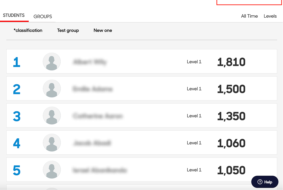 The original leaderboard — before the rebuild.
Users were frustrated.
The code was exhausted.
I analyzed our full repository of customer feedback — past surveys, CS logs, support tickets, in-app data collection. Three problems surfaced repeatedly.
"The confusion wasn't about missing documentation. It was a lack of utility."
Alongside the user pain, the leaderboard ran on legacy Angular code. This created slow load times (2-5 seconds) and techincal debt: it was difficult to maintain and incompatible with the direction the rest of the product was heading.
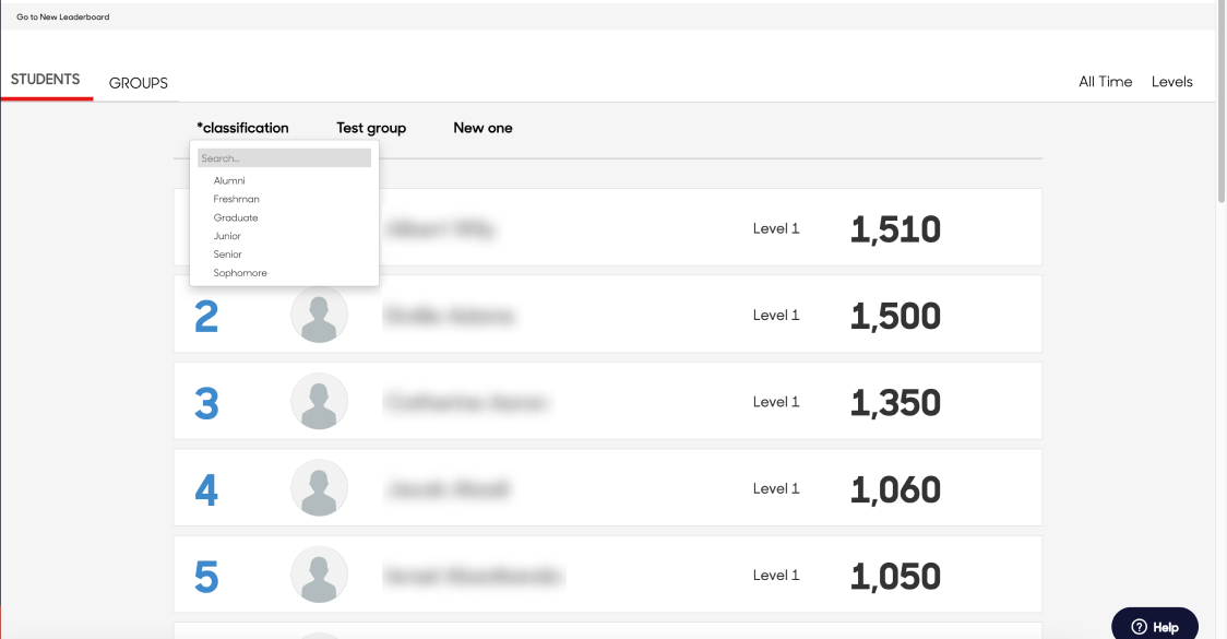 The original group filtering — before the rebuild.
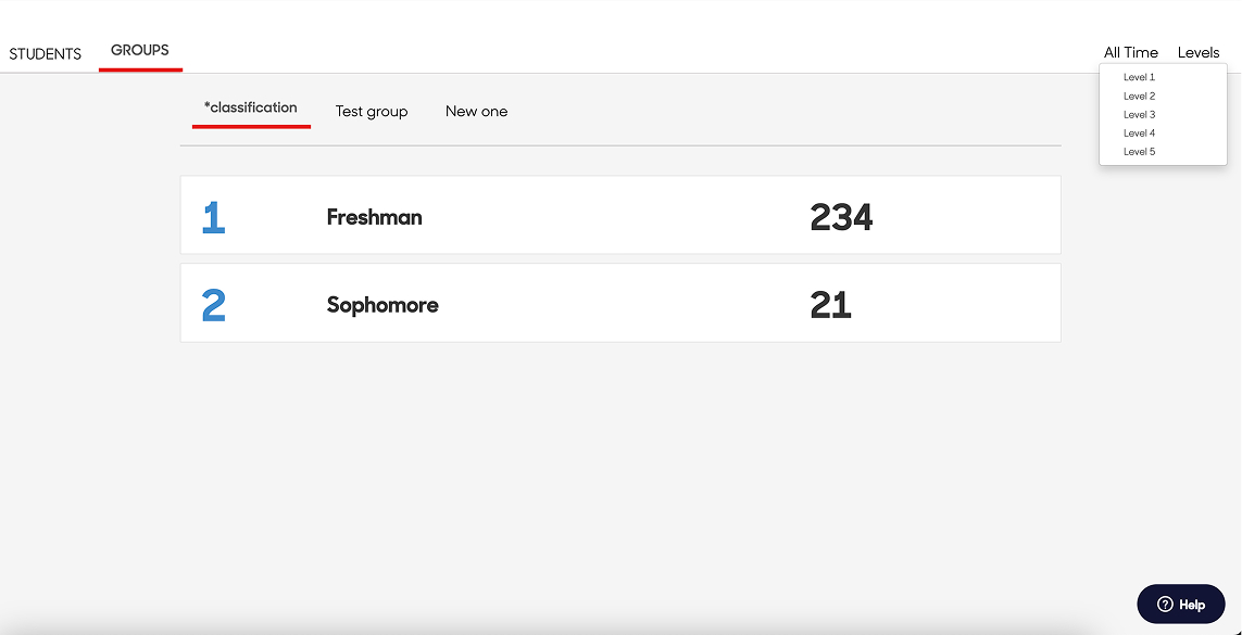 The original time filtering — before the rebuild.
How I validated what
I suspected.
I developed a multi-channel data collection strategy to go beyond anecdotal feedback and build confidence in what we were solving.
Four decisions that changed
the product.
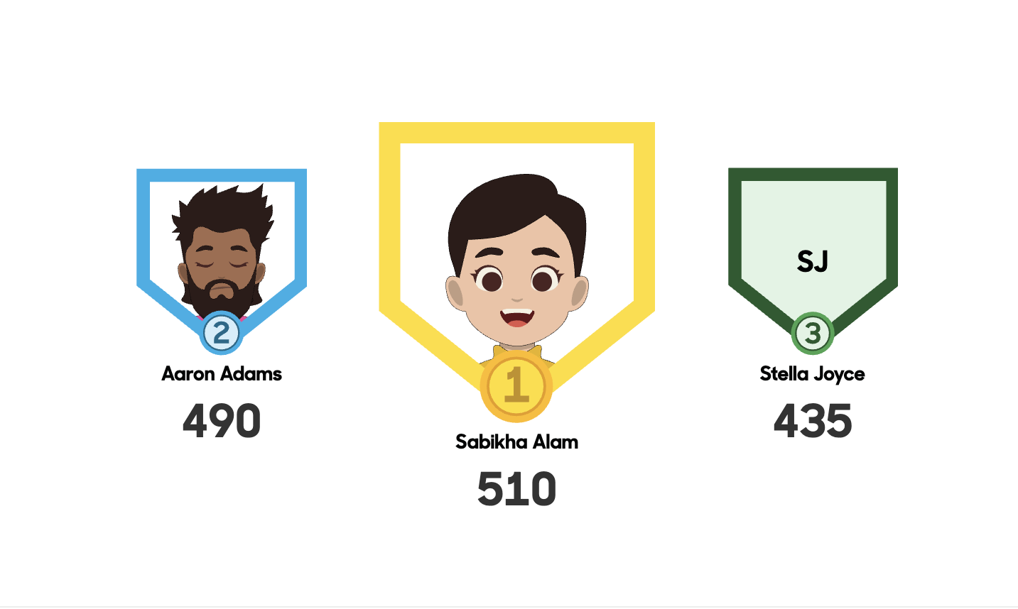 Podium Finish — top 3 treatment
Blue sky → real world.
Budget is a design constraint.
After the initial design phase, I had to shape the project to fit reality: 4–6 weeks, 2–3 sprints, 30-40 story points. That means hard choices on the effort/impact matrix. Not everything made it. The features that survived were the ones that directly addressed the three core pain points discovered in research.
Concessions were made. Features deferred. But the shape we landed on was clean, defensible, and buildable within the constraints we had.
What changed.
Beyond the metrics the filter drawer component became a reusable pattern applied across the rest of the app. The leaderboard went from a feature clients complained about to one they actively showcased on campus screens, in newsletters, and on social media.
The podium lives on large displays in campus buildings. That visibility was always the point. Now the design matches it.